

The problem
Humanity is asking too much from the
nature, the resources are ending pretty fast,
and the cost of life is increasing day by day. An
example is the cost of the electric bill and our
consumptions.
Goal
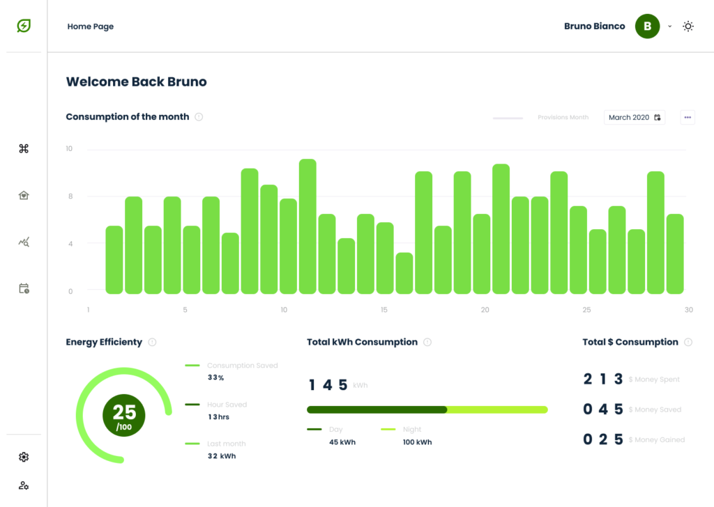
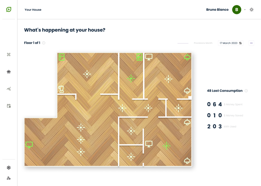
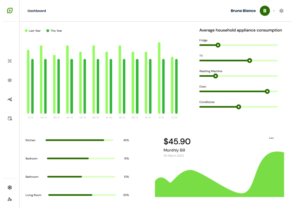
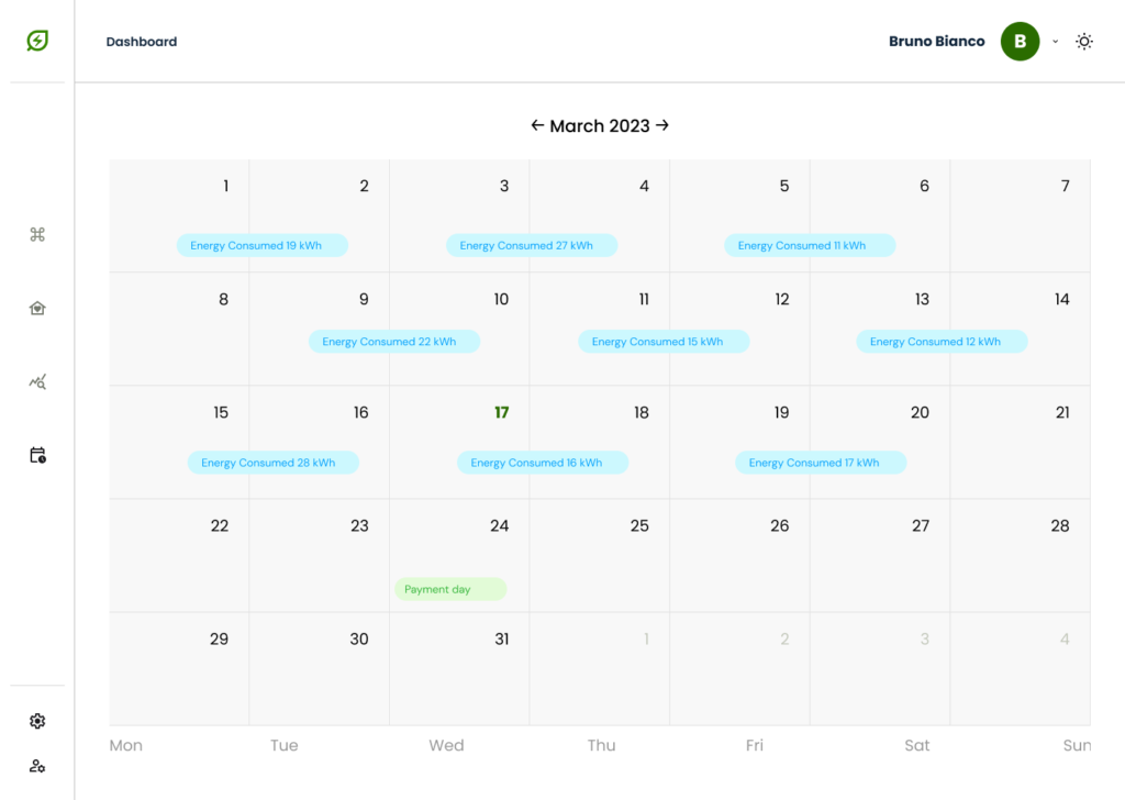
Design an Energy Monitoring Consumption
Website to be user-friendly by providing clear
navigation and offering fast energy monitoring
Responsibilities
Conducting interviews, paper and digital wireframing, low and high-fidelity prototyping, conducting usability studies, accounting for
accessibility, and iterating on designs.
User research: Summary
I conducted user interviews, which I then transformed into empathic maps to better understand
the target user and their needs. I have found that many target users do not use any apps or sites
that monitor the energy consumption of their homes. However, many energy monitoring
companies and websites provide this information confusingly and frustratingly for many
target users. This has made a normally pleasant experience a challenge for them, defeating the
purpose of monitoring.
User research: Paint Point
Reading
Monitoring website designs are often busy,
which results in confusing navigation
Navigation
It is not always clear what steps to take to
search for certain information is
Experience
Monitoring websites don’t provide an engaging browsing experience
User research: Personas
With my busy schedule, I often find myself rushing out of the house without realizing I’ve left multiple electronic devices plugged in and consuming unnecessary energy.

Mark Stephenson
Student / 21 y.o
Being constantly caught up in my hectic routine, I often forget to turn off lights and appliances around the house, resulting in increased energy consumption and higher utility bills.

Tommy Blue
Worker / 45 y.o
The fast-paced nature of my life often leads to forgetfulness, and unfortunately, that sometimes means leaving the house with lights on or forgetting to power down energy-draining appliances.

Lemon Rok
Remote Worker / 32 y.o
Usability study: parameters
Study Type
Unmoderated usability study
Location
Italy, remote
Participants
5 participants
Length
20 – 30 minutes
Finding #1
Webflow
Direction and understanding of the site
and the services offered
Finding #2
Account
Users find it difficult to reach their page
and the most important information
Finding #3
Insights
Users had difficulty reading their energy reports and had no comparison tools to understand the pros and cons
Design research: Sitemap
Sitemap
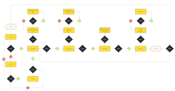
Difficulty with website navigation was a primary pain point for users, so I used that knowledge to create a sitemap.
My goal here was to make strategic information architecture decisions that would improve overall website navigation. The structure I chose was designed to make things simple and easy.
Design research: Design System
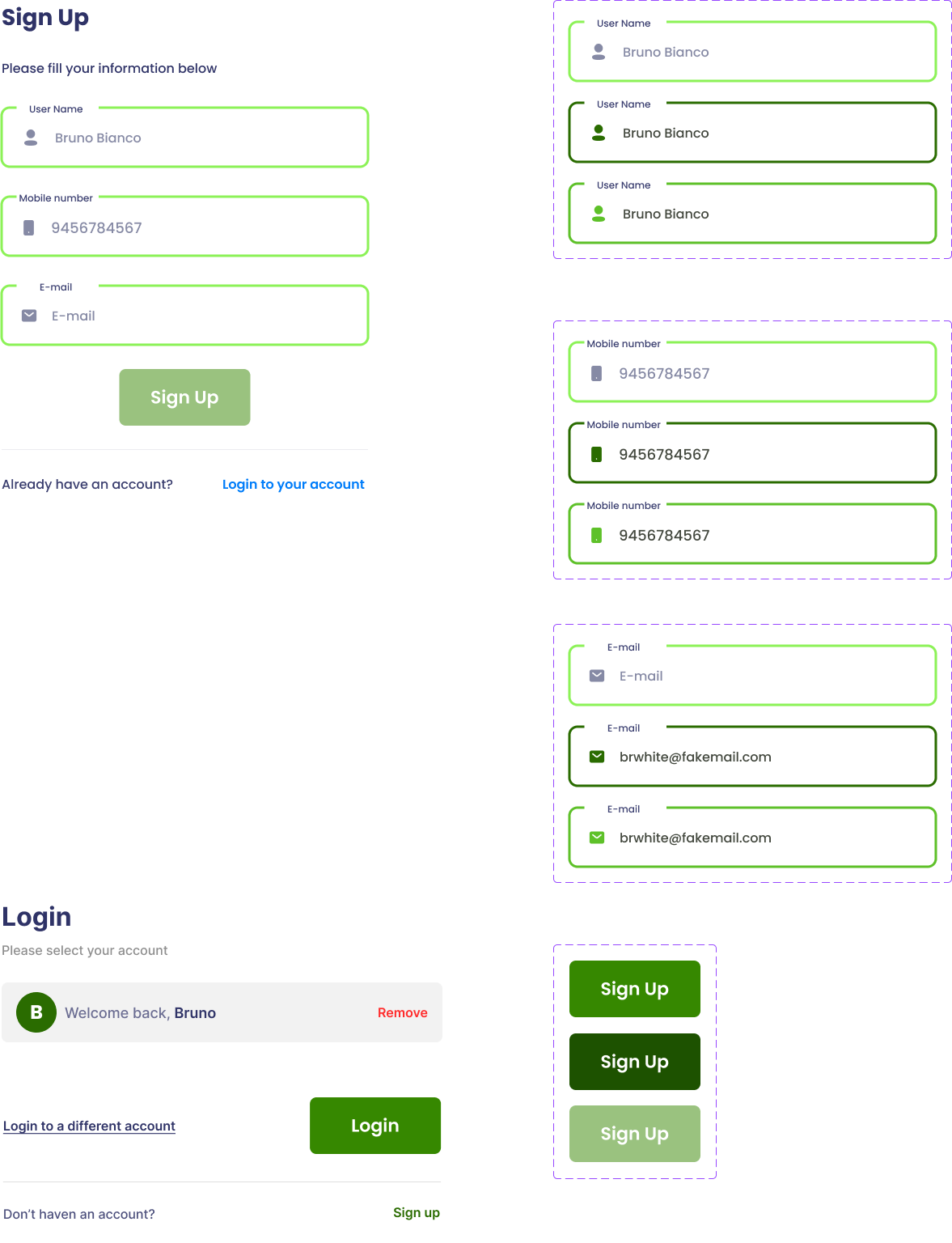
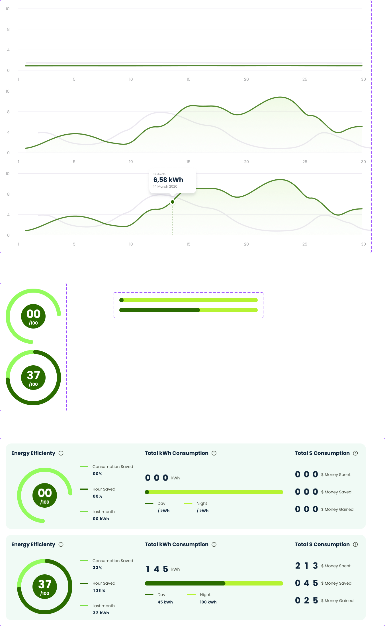
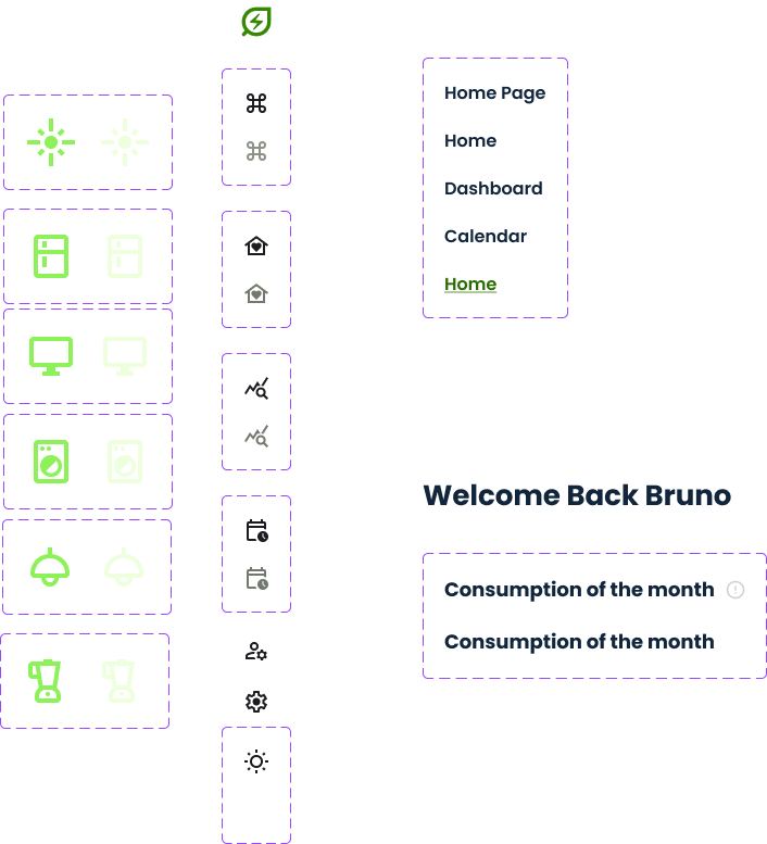
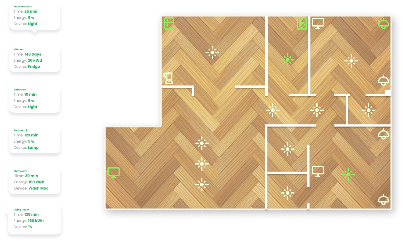
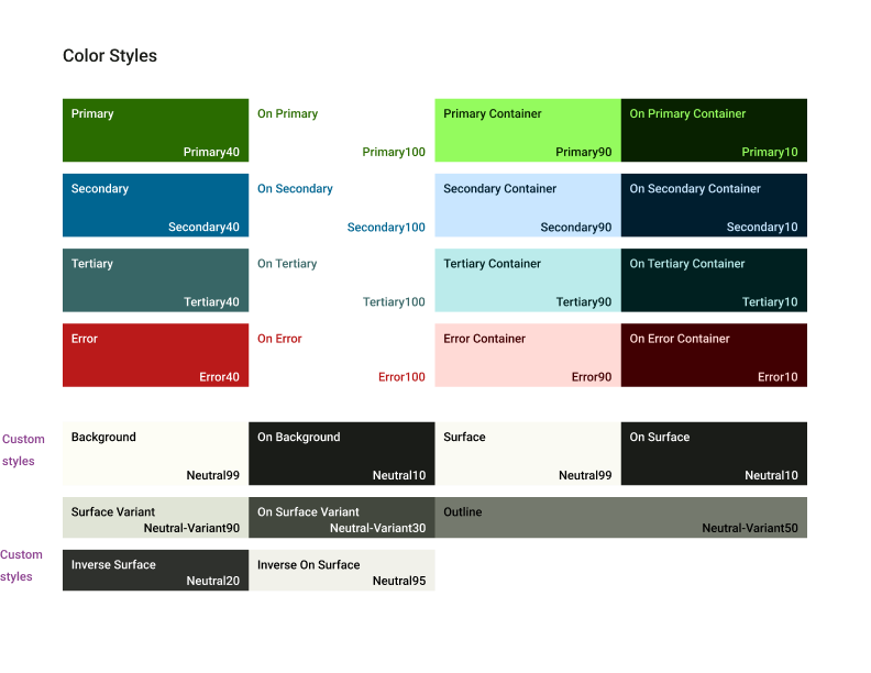
From simple Color Palette…
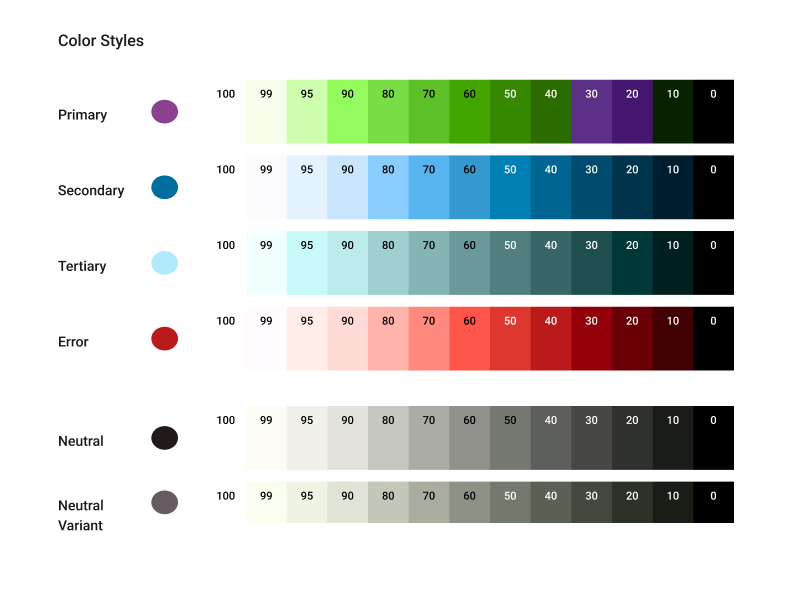
…to Custom Style.
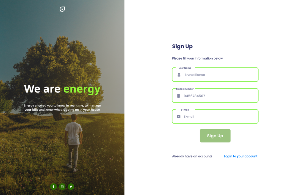
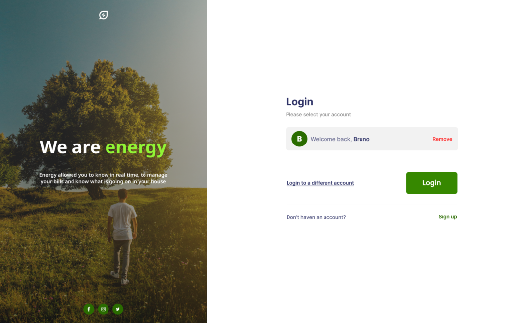
Responsive, reusable, documented components that support states and variations in the most common uses.
